5 Ways To Use Matplotlib For All Your Data Visualization Needs

Matplotlib is no one-trick pony when it comes to graphic representation. Matplotlib can plot anything from simple bar graphs and advanced 3D plots, to full-scale medical imaging from MRI and CT scans.
Created with real-time data, graphing images no longer need to come from a snapshot in time but instead can be regenerated with the most up-to-date information. This provides unprecedented power to spot current trends and inflections during data analysis.
Although Matplotlib syntax is simple, it's flexibility demands some time spent exploring it's various features, so that power-devs can take maximum advantage of the range of possibilities in their coding. While the possibilities are limitless, there are five primary modes that we can get started with using Matplotlib to represent complex data visually
When to use a bar graph
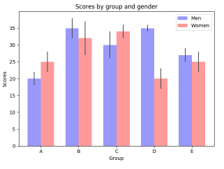
Bar graphs are often the easiest way to represent two-dimensional data such as test scores or demographic distributions. Bar graphs are best used when one variable is categorical and the other is continuous.
( Source:https://matplotlib.org/tutorials/introductory/sample_plots.html )
When to create a bar graph
It's a simple matter to represent both the raw data, as well as the standard deviation (or another variability measurement), signified by vertical black lines across the graph. The bar() and barh() functions are used to create this type of graph, with a syntax that looks something like:
<span style="color: #008800; font-weight: bold;">import <span style="color: #0e84b5; font-weight: bold;">matplotlib.pyplot <span style="color: #008800; font-weight: bold;">as <span style="color: #0e84b5; font-weight: bold;">plt
rects1 <span style="color: #333333;">= plt<span style="color: #333333;">.bar(index, means_men, bar_width, alpha<span style="color: #333333;">=opacity, color<span style="color: #333333;">=<span style="background-color: #fff0f0;">'b', yerr<span style="color: #333333;">=std_men, Kill_kw<span style="color: #333333;">=Kill_config, label<span style="color: #333333;">=<span style="background-color: #fff0f0;">'Men')
rects2 <span style="color: #333333;">= plt<span style="color: #333333;">.bar(index <span style="color: #333333;">+ bar_width, means_women, bar_width, alpha<span style="color: #333333;">=opacity, color<span style="color: #333333;">=<span style="background-color: #fff0f0;">'r',yerr<span style="color: #333333;">=std_women, Kill_kw<span style="color: #333333;">=Kill_config, label<span style="color: #333333;">=<span style="background-color: #fff0f0;">'Women')
This example creates a vertical bar graph using bar(), with the deviation represented using the yerr= parameter. A horizontal graph could be created instead, using the similar barh() function.
When to use a scatter plot
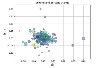
The scatter plot is a useful tool for displaying correlations, such as changes that take place over time or over temperature variations. Anytime a "variable A" is modified in order to observe the change in "variable B," a scatter plot can represent the outcome.
( Source:https://matplotlib.org/tutorials/introductory/sample_plots.html )
How to create a scatter plot
While bar graphs are useful for categorical and continuous variables, scatter plots are best used both variables are continuous. The scatter() function benefits from the pandas implementation of data frames, allowing large datasets to be populated without the use of iterative loops. Thousands of data points can be loaded with a one-liner such as:
plt<span style="color: #333333;">.scatter(delta1[:<span style="color: #333333;">–<span style="color: #0000dd; font-weight: bold;">1], delta1[<span style="color: #0000dd; font-weight: bold;">1:], c<span style="color: #333333;">=color, s<span style="color: #333333;">=volume, alpha<span style="color: #333333;">=<span style="color: #6600ee; font-weight: bold;">0.5)# where "delta" is a column in the data frame, for example.
The real power of Matplotlib's scatter function is that because each variable passed into scatter() can be loaded as a column of a data frame (or a Pandas series), elements such as the color and size of each point can be altered based on set criteria. In this way, multi-dimensional scenarios such as stock price/volume charts can be represented visually with perfect clarity.
When to use a histogram
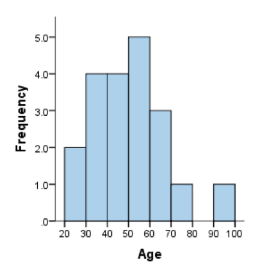
Histograms are best used for displaying distributions that can be separated into simple intervals known as 'bins'. An example would be to display data points accumulated over 10-year periods:
( source:https://statistics.laerd.com/statistical-guides/understanding-histograms.php )
How to create a histogram
Histograms may roughly appear the same as bar graphs, but they are different. Histograms are used to visualize monovariate continuous distributions while bar plots are for comparing metrics or distributions between multiple categories.
The abilities of hist() far exceed that of bar() in that it can automatically create bins based on the data supplied. A command as simple as:
1  plt<span style="color: #333333;">.hist(x, num_bins, density<span style="color: #333333;">=<span style="color: #0000dd; font-weight: bold;">1)
2
is able to populate a histogram with bins delimited by the num_bins variable. Num_bins can simply be an integer representing the number of bins we wish to divide the data into, or can contain a "strategy" for creating bins, such as the square root (sqrt) or the Freedman Diaconis Estimator (fd).
When to use a line graph
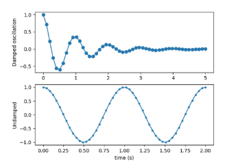
Line plots are mostly used to show changes that occur over time, as the X-axis will almost always be a time period. As such, line plots can be one of the most useful from an IT perspective, as common metrics such as server load, logged in users, or network traffic can be represented.
( Source:https://matplotlib.org/tutorials/introductory/sample_plots.html )
How to create a line plot
Line graphs are probably the easiest to create with Matplotlib. A command as simple as plt.plot([1,2,3,4]) creates a basic but functional graph. Additions such as specifying the X-axis values or overlaying a second line plot of a different color are simple with the plot() function. A more complex image representing multiple axes can be created using subplot() instead of plot().
When to use widgets
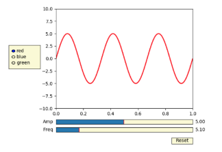
In addition to Matplotlib's extensive static graphing abilities, it's possible for the user to dynamically adjust graphs on the fly. Widgets introduce interactivity into the output so that alternate scenarios can be tested in real time by utilizing sliders, radio buttons, and menus.
( Source:https://matplotlib.org/tutorials/introductory/sample_plots.html )
How to create a widget
Widgets are made possible by using the on_changed() call, which re-executes the graph calculation function after an interactive element has been modified. This allows the possibility of time-lapse views, predicting system stability as loads are increased, or other scenarios based on experimental criteria.
Conclusion
Compared to Excel, the pandas-Matplotlib combo is both more intuitive and far more powerful. This is in addition to the obvious advantage that it doesn't require Excel, with Matplotlib being independent of the GUI or other software on the system. Matplotlib graphs can be created within the software as needed, without tasking over to Excel to view results. Furthermore, the user input widgets allow for easy real-time updates.
In terms of the learning curve, data scientists with MATLAB and R expertise will find Matplotlib's syntax familiar, while newbies will grasp the intuitive nature of Matplotlib's commands combined with pandas' data structures. Most Python developers will only need to build a couple simple examples before they are ready to implement a complex real-world project in Matplotlib.
Matplotlib's visual display tools give developers and data scientists the ability to represent information in ways that help to identify trends and analyze complex scenarios. With obvious benefits to scientists, economists, IT admins, and practically any other data-driven profession, the simplicity of Matplotlib with pandas removes the intimidation factor when it comes to generating rich data graphics.
delivered to your inbox.
By submitting this form you agree to receive marketing emails from CBT Nuggets and that you have read, understood and are able to consent to our privacy policy.
